
Design Processes and Planning

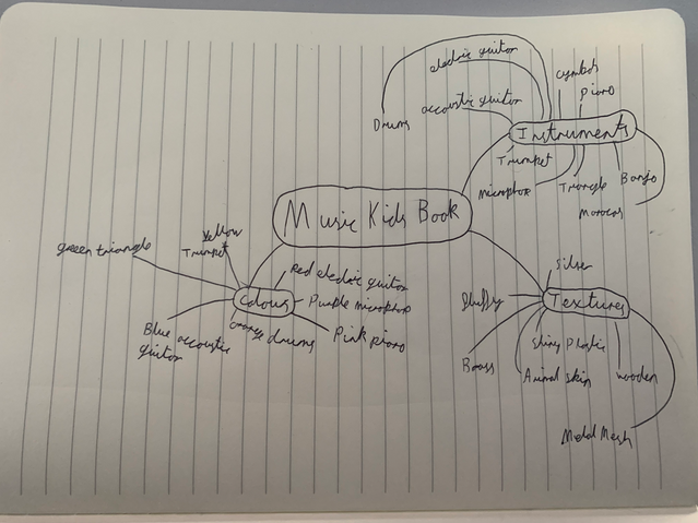


I started off my children's books creating the sprites for each of the pages. I used the same technique throughout the whole process that is tracing an image of each instrument on adobe illustrator as i was not confident in my abilities to draw them myself. However for the red electric guitar i took the image myself as this is the guitar I own myself

I started off by importing an image from google of a front on view of a drum kit, i chose this image over other i saw as it gave the perspective i wanted to give for the instrument in my book and it had the colours i wanted to have for that page in the book. One issue i might have in the future by doing this is problems with copyright as some images on google are not free to use.

To put in the extra effort and to avoid copyright issues as i mentioned before i decided to take a picture of my personal guitar I owned at home to import to illustrator to trace to use in my book. My thought process behind this decision is that i want my book to be as professional and detailed as possible so i felt this would achieve this. I used the same technique as i did for the drum for this instrument.

For this instrument i used a similar technique as i did for the other guitar. I wanted to use the same techniques throughout most of the design processes as i wanted to keep to one theme and not have any inconsistencies in my work.


After this i lowered the opacity of the image in the background and created a new layer for me to draw on because if i make any mistakes i will be able to erase them without having to worry about the background image being effected. Additionally having a separate layer for my tracing and the image would allow me to hide the bottom layer leaving only the tracing. One issue i had with creating my sprites like this is that it is very time consuming as i want to be as accurate as possible.

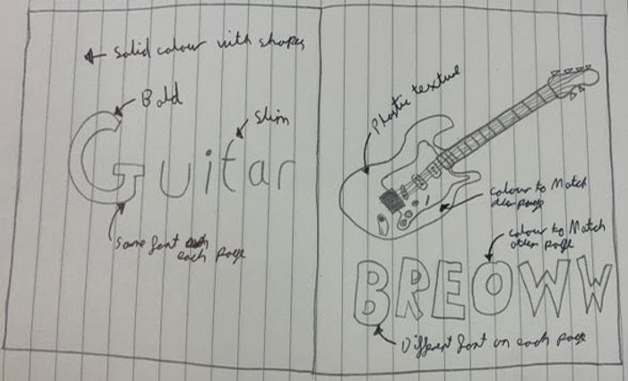
This is what the finished product looks like after i traced my guitar. I think that this came out very well and looks effective. One thing i struggled with however was drawing each of the individual strings as they required me to zoom in and scroll down each time was time consuming and i felt in some places the lines did not join up smoothly.

this is what the tracing looks like after i finished tracing and removed the background image. i used a variety of brush widths to get my desired effect. Again i feel that this was effective and the sprite i created looked how i imagined.


I wanted to use photoshop to add the textures i chose underneath my instruments give the effect that you would be able to touch them in the physical product. I initially was going to do this on illustrator however i decided to change this to photoshop as i am more confident in my abilities on this software as i have used it the most. I did not want to risk using illustrator and risk my product not being as visually appeasing as i wished so this is the reasoning behind this decision. Additionally, i used the art board tool on photoshop to keep all of my page designs together as it would allow me to see them next to each-other. If they were open in separate windows i might make the mistake of not seeing any design inconstancies until the end.

To continue with my sprite design, i imported the vector graphic of the electric guitar to photoshop. I then used a red plastic texture behind as this is the texture and colour i had planned for this page. After this i selected the area i wished to have as the texture and then deleted any excess texture to have the base of the body of the guitar.

i used the same technique to add a wood texture as the fretboard and headstock which i felt looked effective. I then added grey solid colour for the pickups and dials as metal is commonly illustrated using this colour.


For my next instrument i chose the acoustic guitar as i felt it would be easier for me doing a similar instrument. I used the same technique as before however i just ed different textures for each of the parts. I started off with the base vector from illustrator and i added a wooden texture for the base of the head and of the guitar.
to finish it off i adjusted the brightness of the wood and grey to make it look less dull as i felt it looked too dark. I then added a metal texture for any extra details and made the pick guard black as i wanted the graphic to be more in depth.

I then decided to use the same texture for the fretboard however i used the brightness and contrast filter layer as a clipping mask to give the effect that it was a darker wood. I feel that this was effective as it lead to it not looking too similar as a whole.

To finish off this sprite i wanted to add more details to make it look more effective. So i changed how dark the board is as i felt that it make it hard to see the strings and it overpowered the sprite. After this i used the burn tool and brightness and contrast tool to give an effect of the pick guard because this is seen on most guitars. i finally added the lasting details of the tuners to grey and filling in the hole as a brown.


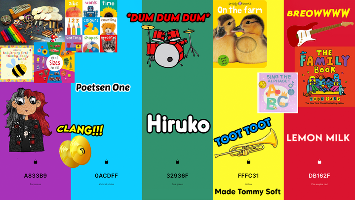
To start off my book I used the colour pallet that had the most amount of votes in m primary research questionnaire as I felt this looked the best and I agreed it would look best for children as its bright but not too much. I originally had the text going behind the guitar as I felt this would be a nice effect.
I decided to change the text to go across each page after some feedback with my skills teacher as she told me it would look better to have something to link the two pages together visually. after doing this i felt it looked a lot better visually however i did not feel it was complete yet.


i added shapes in the background of the pages as i felt this gave a more in depth page rather than a plain solid colour. I felt at this point these pages were completed and i could not add anymore to them.
For the drums page I went through a similar design process where I started off with the instrument sprite and the sounds they make with the instrument name on the left page.


Following with my teachers advice i wanted to make these pages link together so i decided to put the sounds leaking onto the left page which i felt looked effective.
i felt like the page was not detailed enough so i added circles in the backgrounds to keep in with the theme of the previous page at this point i decided this is what i wanted to do for the rest of the book.


I wanted to create my own shapes for the background of my children's book as this would lead to me having more creative freedom with what i can use in the book, additionally, i think it would be better to use my own graphics in comparison with taking someone else's from google as it shows i am putting more detail into my work. so this is what i did for this page.

I duplicated each of the spirals to create a pattern in the background like i did for the other pages using the shape tool. I felt like the black was too overpowering so i selected the pattern and changed the colour to a different shade of the purple used in the background to give the effect i desired.


After this i added the microphone and text to the right page like the rest of my book without the shapes, i also added a small drop shadow as when i did not do this it felt too basic and it did not blend well with the text.
I copied the pattern from the left page and changed the colour again to white to bend well with the cream background and purple text.


For the electric guitar pages i used the same techniques again as the microphone pages using a shape i created in black.
To create this shape i used the star tool to make a one of the graphics for the background of one of my pages, i wanted to have a different shape for each of the pages so i felt a star is a very recognisable shape for children to see as i want my book to be as accommodating towards my target audience as possible.


I decided rounded off the corners of the star to make it look more child friendly as before the sharp edges of the star would not fit in with the theme of the rest of my book. To add to this the sharp edges may look to hard on the Childs eye which could cause them to stop reading the book.
I changed the colours of the stars to match their backgrounds which i feel was really effective and brought the pages together. I additionally i did a similar effect to the acoustic guitar page with the text spreading across the two pages.


At this point in creating my book i felt confident enough in my processes that i did not experiment much with this page as i wanted to keep with the theme and not differ too much just in case it did not match everything i already created so i stuck to the same colour pallet and used a square shape with rounded corners which i did not use before.
After creating the pages of my book i moved on to creating the spine, front and back of the book as this i all i had left to create. I initially wanted my spine to just have the text but then i thought back to my research i remembered that it is common to have the publishing companies logo on it so i decided to do that. After spending some time reflecting on my work i felt the simple logo with no colours did not look appealing so i sized up the logo and added the colours from the book in the logo to give it more colour.


For my front cover i wanted to keep true to my planning so i added the drum kit i designed to the front and added my title to the top using the colours from the book as each of the letters.
I felt that the background was causing the front cover to look too simple so i added a wave pattern going up fading from pink to cream. i also additionally added my name to the bottom as this is commonly seen in other books.


Because of this i added the wave pattern from the front page and i added a blurb to summarise what is inside of the book. Additionally, i felt that looking at a barcode it looked like a piano to me so this is what i did at the bottom which i felt would be a nice detail to add.
